“Bronzed Validity” by Stacey L. Kirby
Close Looks: "Bronzed Validity" by Stacey L. Kirby
Click on the arrow below to listen to an audio description of the featured work. Click on the transcript button to read the description.
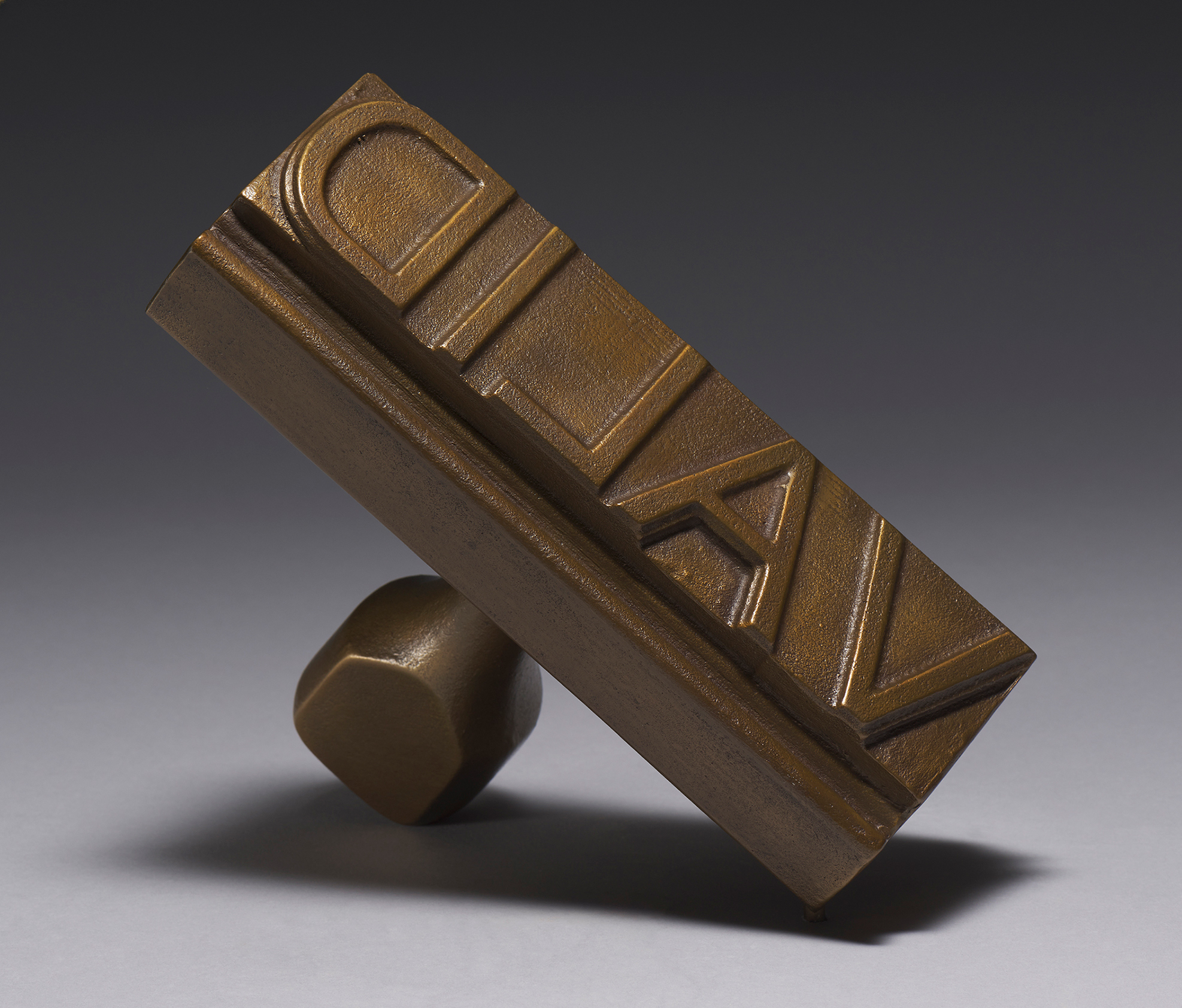
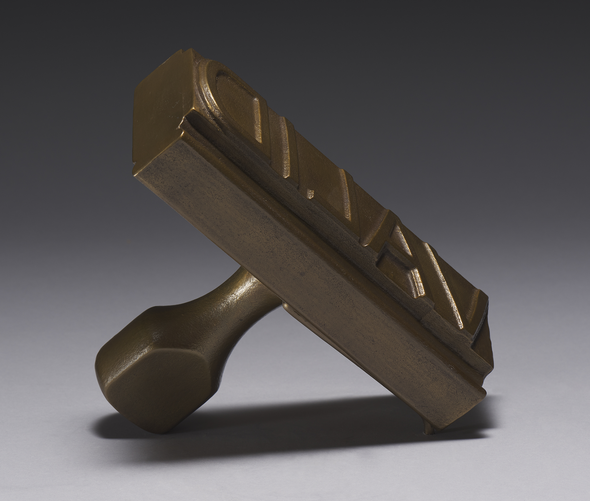
This sculpture is in the shape of a stamp, the kind of stamp used in offices and other administrative settings to stamp words or phrases in ink on documents: like “Received” or “Paid.” It is considerably larger than a typical office stamp, measuring eight inches long while an ordinary stamp might be approximately two inches long. The entire sculpture is made of bronze. Installed in the Museum, the sculpture is positioned so that the letters face the front of the case. The weight of the bronze stamp is supported by the lower right corner of the letters and the top of the handle. We see the bottom of the stamp and the letters on it in a diagonal orientation, but the remainder of this description speaks of them as though they are on a horizontal plane instead.
Because the sculpture imitates the appearance of an office stamp, the letters along the rectangular surface appear backwards. That is, each letter is backwards and the word they spell – VALID – in all capital letters that extend the full height of the rectangular surface, is backwards too. At the left edge of the lettering is the curved form of the capital D and at the right edge one slanted side of the capital V. Judging by the shadows and highlights visible around most of the interior areas of the letters D, L, A, and V, each letter projects from the base at a uniform height. At the bottom of the letter A, however, and along the exterior edges of the D and the V, the distance is greater, as though the base in those areas was carved more deeply away. In those more deeply carved areas around the D and V and at the bottom of the A, there is also a beveled edge to the forms of the letters, indicating that the greater depth is an intentional feature rather than an accidental flaw. The entire surface of the lettered rectangle appears grainy.
The lettered rectangle projects slightly from the rest of the stamp’s form. At the bottom, a beveled edge connects to a sort of valley that runs the length of the stamp and then ridge, beveled at the stamp’s front side and its back side, also running the length of the stamp. The texture along the bottom, beveled portion of the stamp, as well as the texture along its plainer top portion, is grainy like that of the lettered area, but on the top and bottom the texture also includes wavy lines that resemble wood grain.
On the short sides of the stamp, a smoother, more polished and yellower surface accentuates the elegant profile of the stamp’s form. The beveled edges of the shape on the bottom look in this profile a little bit like the lip of a jar – the jar formed by the simpler rectangular shapes of the rest of the stamp’s side. These shapes and effects are most visible on the side that points upward, but they are also there on the side closest to the case’s floor.
The back of the sculpture, where the handle joins the rectangular form that holds the lettering, also has the grainy texture of the lettered side, and the contrast with the shine of the short sides makes the grainy texture stand out. The handle looks like a composite of cylindrical forms, or perhaps like a furniture leg that has been turned on a lathe. It is widest at the top of the handle (which, remember, is positioned so that the sculpture rests on it here), and it is narrowest in the middle. From the narrow part of the handle, the cylinder expands slightly to the place where it attaches to the rectangle. The gradations from widest to narrowest to wider parts are all gracefully curved. Except at the widest part of the handle on the side that aligns with the bottom of the rectangle – here it is as though a section of the curved form has been sliced off, leaving a flat section shaped somewhat like a slide of bread.
The top of the handle, which on an ordinary stamp is designed to fit in the palm of a human hand, has a smooth shiny surface that contrasts with the grainy texture visible on most other parts of the sculpture, perhaps polished by contact with the palm of a giant hand.
In the case in the Museum, the sculpture casts a shadow. The shadow emphasizes the contour of the long rectangular shape of the lettered area of the stamp as well as the elegant curved silhouette of the beveled edges and ridge. Within that shadow, a slightly darker shadow forms where light has fallen on the handle with its own rounded outline, looking a little longer in its shadow than it is in reality.
This work, heavy and shiny in solid bronze, is enormous for a stamp, and would require both hands to lift. I can’t think of a material more suited to confer the seriousness of the museum and the weight of the history of sculpture. This elevation through size and medium manages not to betray the humility and nostalgia the form carries. The familiar stamp handle, flat on the thumb side, brings to mind the front desk at my childhood library or my first office job. It’s a relic from an era of paper records that hasn’t entirely disappeared, an homage to the retrograde bureaucracy of the metal filing cabinet instead of the cloud.
Both readable and unreadable, VALID jumps out clear and capitalized, except backward, a reflection not a declaration. This isn’t just an object, but an implied motion, a potential act of validation that raises questions about belonging and authority. I am pushed to ask what around me needs validating, what could or should be stamped? Though I long to take up the lovely and unwieldy sculpture, it would be absurd. Not only would it break all the rules, but what right would I have to wield it? What right do any of us have?
The art museum confers value on whatever we find inside, yet here is a remarkable object that slaps that truth right out of my hands. No, it raises its eyebrows pointedly and waits for me to drop that truth, embarrassed I brought it along.
Kirby is an artist who puts us at ease with officious pomp and then interrogates us sidelong. Her elaborate send up of government as a queer “civil servant” raises questions about the ways civil and legal society refuses the validity of people’s identities. Her work imagines a world where government validates diverse and lived experiences.
– Robin Holmes is an art historian, sculptor, and mom. She writes about power, gender, and race in representations of North Africa by modern French artists.

Stacey L. Kirby, born 1976, Bronzed VALIDity, 2019, cast bronze, 8 × 6 × 2 in., 15 lb. (20.3 × 15.2 × 5.1 cm, 6.80396 kg). Ackland Art Museum, University of North Carolina at Chapel Hill. Ackland Fund, 2020.7. © 2019 Stacey L. Kirby.

I first noticed the material object: a heavy-looking bronze stamp. It looks very official – like something one would find in a historical courtroom or lawyer’s office. Its heaviness also reminds me of a judge’s gavel and carries the weight of authority. The object appears to be something that is meant to confirm a binary outcome: approved or denied, guilty or not guilty, etc.
Contrary to what I would expect an official stamp of this nature to say, I find myself reading the word, “VALID.” Because it is a stamp and the word is backwards, it took my brain a second to register what it said. I was pleasantly surprised, and this delay helped me appreciate Stacey Kirby’s sense of humor and irony.
The word, “valid,” has become increasingly popular in contemporary discourse. It is a positive affirmation that one’s experiences and emotions are real and worthy of respect; especially when dominating cultures try to say otherwise. Rather than being judged as this or that, we can simply be valid.
– Jeanine Tatlock is an artist, activist, and alumna of UNC Chapel Hill’s Master of Fine Arts in Studio Art program.
- What image or word associations do you have with the word “valid”?
- The title of this work is Bronzed VALIDity. What does the act of bronzing do? What objects do you associate with that action and material?
- This bronze sculpture is based on a smaller customized rubber ink stamp that the artist has used since 2012. Over the years, the rubber stamp was used over 6,000 times during multiple performative art experiences that engaged the community in questions around citizenship and civil authority. How might the bronze material change the meaning and use of the word on the stamp?
- This sculpture is eight inches wide and six inches tall, much larger than your average stamp. What is the effect of it being oversized?
- How does the use of text impact your view of the sculpture? What are other words that might have a similar impact?
- Read about Bronzed VALIDity in the Ackland’s About the Art guide.
- Visit the artist’s website.
- Watch a short video on the performance VALIDnation, in which Kirby uses her VALID stamp.
- Read a statement from Kirby about VALIDnation and view the VALIDnation Cards at idontdoboxes.org, a magazine exploring LGBTQIA+ experiences in the Southeast and beyond.
- View a timeline of House Bill 2, or the “bathroom bill.”
Public Programs
Close Looks at Cocktail Hour: Stacey L. Kirby’s Bronzed VALIDity
Wednesday, April 21, 2021 | 5:00 – 5:45 p.m. EST
Join the Ackland’s Object Based Teaching Fellow, Erin Dickey, for an informal conversation focused on one work of art from the Ackland’s new Close Looks digital feature. Plan to look closely and think collectively—and bring a drink of your choosing. On April 21, we’ll look at Durham artist Stacey L. Kirby’s Bronzed VALIDity. Registration is limited. Sign up for free tickets to this virtual interactive program here.

Close Looks: “Bronzed Validity” by Stacey L. Kirby is supported in part by the Laughing Gull Foundation.
Header image by Alex Maness.
