
“Japanese Landscape” by Felrath Hines
Close Looks: "Japanese Landscape" by Felrath Hines
Click on the arrow below to listen to an audio description of the featured work. Click on the transcript button to read the description.
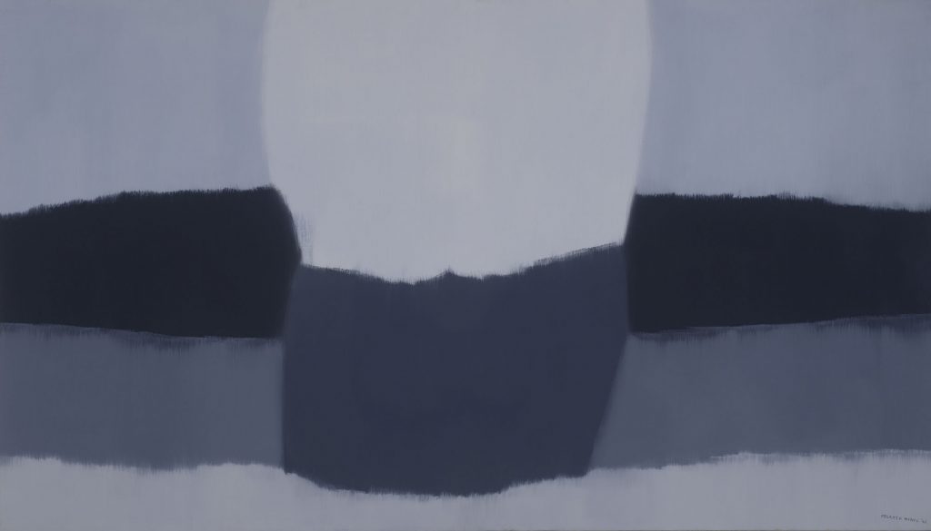
Japanese Landscape is an abstract oil painting on linen measuring four feet tall and seven feet wide. It is composed of nine color-blocked sections in six cool-toned shades of gray. Its size gives it a commanding presence, but its colors make it soothing in nature.
The color blocks are arranged such that some offer a gradient while others offer sharp contrasts. A light shade of gray runs across the bottom of the painting. It ties the entire painting together as it is the only section of color that spans completely from one side of the canvas to the other. Above this horizontal layer of paint, the piece then breaks into three distinct vertical sections that look like misshapen columns. The right and left columns of color are almost identical to each other, while the middle section creates a point of contrast. The two outside columns are colored identically: one stripe of medium blue-gray at its bottom, a stripe of dark gray (the darkest points of the painting) above that and topped with a thicker stripe of light gray identical to the painting’s lower border. The middle column contains only two contrasting shades dividing the space roughly evenly: a dark gray below and a light gray, the brightest point of the painting, above it. The colored sections of the painting are both organic and geometric. The borders between the colors curve and fluctuate throughout the painting. The center column of two layered grays tapers toward the bottom, and the flanking columns of three colors have symmetrically bent or tilted sections that mimic uneven stacks.
The brush strokes are nearly invisible from a distance, but a closer look reveals that the borders between color blocks are far from sharp and clear. Rather, rough brushstrokes blend the borders of colors in a way that softens the divide between shades. There are visible brushstrokes that show intentional but brief integration between colored sections. These meeting points resemble frayed edges of a fine fabric in places. In some areas of the canvas, entire brushstrokes of color are out of place. Each block of color itself also contains areas of slightly darker and lighter patches, which gives these seemingly uniform patches a degree of depth.
In the bottom right corner is the artist’s signature and year: “FELRATH HINES ’65.” Like the wavering lines between color blocks in the picture, the signature does not sit parallel with the lower edge of the frame. Instead, it curves downward to the right to meet the corner of the picture.
The abstract shapes in the painting, viewed loosely, invoke a misty and obscure mountainscape. Moving around the room allows for the colors to shift and jump. The layered columns on the outer edges of the composition can appear like the foreground of the painting or be set into the background, thereby bringing the central column of two colors forward. Perception of the painting also depends on the perspective of the observer.
First, I see the beautiful handling of paints and the harmonious interplay between different shades of gray. The fluid way the artist switched between hard, clean edges and soft, blurred ones added to the overall atmospheric effect of the painting. A large column of white and bluish gray penetrates the soft ground beneath, breaking up the rows of paint from meeting. I am drawn to the white mass like a moth drawn to light, mesmerized. Second, I see a barren wasteland. There’s a sense of stillness and tranquility that the deserted landscape. Finally, I see the work of a painter who has put a lot of care and intention into his practice and his work.
– Phuong Duyen Nguyen is an MFA student in studio art and Morrison Fellow at UNC-Chapel Hill.
Felrath Hines, American, 1913-1993, Japanese Landscape, 1965, oil on linen, canvas: 48 x 84 in. (121.9 x 213.4 cm) frame: 48 9/16 × 84 9/16 in. (123.3 × 214.8 cm). Ackland Art Museum, Gift of Dorothy Fisher, wife of the artist, 2009.14.1.
Looking at Felrath Hines’s Japanese Landscape, I see an immersively-scaled abstract painting in a few shades of bluish-gray. The palette of the painting feels muted, restrained. As I look at it, thinking about landscape, I can pick out the essence of a horizon line, a hazy grayish white that drifts along the length of the lower third of the painting. Above that line, my perception of the dimensionality of the image takes multiple branching paths. Looked at it one way, the two central color blocks of the image — a curving square of navy topped by another rough square of pale gray — appear as if in the foreground, emerging out from the center of the painting towards the viewer. But if I take another look, the six flanking rectangles, functioning as abstracted coulisses in an ideal landscape, seem closer to me, closing in upon the central forms like curtains on a stage.
I can see that what initially appeared to me to be discrete units of color, marking out the separate zones of the painting, are blurred around their edges. Brushy strokes blend the shades of blue and
gray into one another. In some places, thin lines of dark blue extend well into the lighter-colored boxes. Similarly, the lack of hard edges makes it challenging to define the shapes — I’ve been calling them rectangles and squares, but the imperfection of the lines and where the colors meet seems to demand a looser term. At the same time, the painting has a rough symmetry.
This compositional vagueness calls to mind memories of oceanside fog, where the water blends with the air so that it’s difficult to distinguish each element from the other. It reminds me of very early morning or late evening, temporal situations where it’s impossible to figure out exactly when night turns into day, and day slips into night. The cool blues and grays evoke a minor chill, like how the air feels in early spring or late fall, an imperceptible shift of seasons.
– Erin Dickey is a PhD Candidate in Art History at UNC-Chapel Hill and the Object-Based Teaching Fellow at the Ackland Art Museum.
This painting seems to be a work of abstract art, with overlapping gray squares producing a non-representational landscape. I see that the painter is an African American man who worked for many years as a leader in the field of art conservatorship, and thus would have been exposed to a range of Japanese art in major U.S. museums. I don’t see any direct signs of Japanese influence, but I do see an appreciation of the wabi and sabi aesthetics from Japanese culture, which often includes images that are asymmetrical, natural, withered, and chill/cold. The gray squares are reminiscent of the clouds that often fill a work of Japanese
medieval landscape painting such as the work of the mysterious artist known as Tenshō Shūbun. See the work Mountain Landscape in the collection of The Metropolitan Museum of Art, for example: https://www.metmuseum.org/art/collection/search/53223
– Morgan Pitelka is Professor of Asian Studies and History at UNC-Chapel Hill. He is also Chair of the Department of Asian and Middle Eastern Studies, and coeditor of the Journal of Japanese Studies at UNC-Chapel Hill.
The first time I looked at the painting I felt serenity, I felt calm also with a touch of melancholy. It seems like a quiet, meditative landscape. It’s the centeredness that makes you feel that way. There’s a balance to it.
It’s a perspective painting. It’s light against dark. The thing in front feels more important. The painting has depth; it’s weird how the shapes force a perspective. The shapes do not suggest motion. There seems to be three separate planes: foreground, midground,
and background. Pictures that have perspective are usually landscapes; this painting is a recognizable landscape.
The color palette is reminiscent of Japanese paintings. Every single Japanese painting I can think of has a limited color palette. The natural materials of the painting connect with landscapes. I picture Japanese art being on linen as a common media.
– Elizabeth Walters is a high school art teacher.
- In traditional Japanese art, the natural world is often a source of spiritual insight and an instructive mirror of human emotion. Do you think Hines considered these ideas when titling his painting Japanese Landscape?
- Describe the color in this painting. How do his colors help create a certain mood or conjure specific emotions? What kind of spatial relations are created through color juxtapositions?
- This abstract painting is rather open to interpretation though it is called a landscape. How do the colors, brushstrokes, and lines evoke a landscape? What do you think that they are conveying?
- Felrath Hines was an African American artist who was a member of Spiral, a group of 1960s Black artists organized by Romare Bearden. Even so, Hines rejected the idea that there was a specific style that would qualify a piece as “Black art.” How does Hines’s turn to abstraction and reference to Japanese culture in this painting relate to questions of race and artistic production?
- Felrath Hines was not just an artist but also an art conservator at the Museum of Modern Art, the Smithsonian’s National Portrait Gallery, and the Guggenheim. Art conservation requires a great deal of technical precision. Where do you see these skills reflected in Japanese Landscape?
- Learn more about Felrath Hines and see more of his work on the artist’s website.
- Learn more about the artist collective Spiral to which Hines belonged in this Wall Street Journal article about its significance.
- Watch this video examining another Felrath Hines painting Red Stripe with Green Background, which includes both a recap of Hines’s career as a painter and conservator and a breakdown of some techniques utilized in his abstract style.
- Watch and/or listen to Dr. Floyd Coleman’s discussion about Felrath Hines at the Wyeth Foundation for American Art Symposium 2017: Artists Panel: The African American Art World in Twentieth-Century Washington, DC. (Start at 28:00)
- Watch Virginia Mecklenburg, the chief curator at the Smithsonian American Art Museum, explore the works of various African American artists such as Felrath Hines, Melvin Edwards, Jacob Lawrence, who all engaged in dialogues of Black identity, individual rights, and art. (Start at 42:32)
About the Art
- Felrath Hines’s participation in the African American art collective Spiral during the 1960s indicates his deep engagement with the broader art world and its politics. Hines disagreed, however, with other group members that artistic styles could be categorized as exclusively “Black art.” With abstraction, Hines pushed against the idea that AfricanAmerican artists should only create artworks about Black identity.
- Japanese Landscape dates from Hines’s abstract expressionist period. Abstract expressionism was an American art movement that originated in New York in the 1940s and 1950s and aimed at subjective emotional expression with an emphasis on spontaneous creativity.
- Japanese Landscape is a transitional piece in Hines’s oeuvre, or body of work, between the earlier representational work and the abstract, organic nature of subsequent paintings. Landscape painting was Hines’s original focus, with varying degrees of realism utilized. As an abstract landscape, this painting is indicative of Hines’s transition to his later geometric modernism
- The rough edges between the differently shaded sections of Japanese Landscape contrast with later work by Hines, such as Red Stripe with Green Background, which incorporates much straighter line work and standardized shapes.
About the Artist
1913: Born in Indianapolis, Indiana.
1945: Enrolled in the Art Institute of Chicago and studied design
1947: Transitioned to studying art at the Pratt Institute in New York
1951: Began his career as a conservator in New York City, which he continued throughout life
1963: Joined the Spiral collective, which was formed by artist Romare Bearden
1965: Painted Japanese Landscape
1972: Appointed chief conservator of the Smithsonian Institution’s National Portrait Gallery 1978: Served as Chief Art Conservator at the Smithsonian Institution’s Hirshhorn Museum and Sculpture Garden
1984: Retired from conservation work to paint full time
1993: Died in Silver Spring, Maryland.
Created by:
Elizabeth Allred, Kiara Alvarado Robles, Darauna Davis, Eesha Desai, Mark Garcia, Gustavo Gonzalez, Paige Hannam, Mekhiyah Howze, Jimmy Kruse, Sintya Martinez, Caroline Mcginn, Waverly Mciver, Margaret Moore, Deneb Ortiz, Elizabeth Rowe, Lillian Rutledge, Leighton Walsh, Benjamin Wilson
Edited by:
Emily Duvall and Maggie Cao